The TAGGED postcard was finished and sent out to the printer on Monday, largely in part to the persistence and perfectionism of Matt.
There won't be anything else to do until we meet with the gallery director next week.
Thursday, 8 March 2012
Thursday, 1 March 2012
Week Eight
We're spending this week working on the TAGGED exhibition postcard as a group. Over the last couple of weeks, Matt Pham has been working on the draft, as well as meeting with the art students from other majors to collect work for the letters of the title wall. Now we have to compile and photograph the sketches, as well as work on our draft for the "graphic design" D.
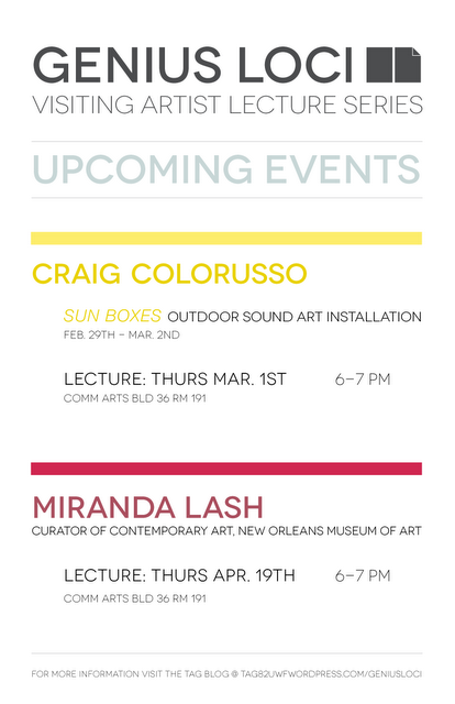
Also, due to the possibility of rain, the Craig Colorusso event was pushed to next week. Consequently, the dates on both the event and Genius Loci posters needed to be edited, reprinted and cut. (30 Genius Loci posters, 30 Installation posters, 6 large format Genius Loci posters)

Craig Colorusso Genius Loci poster
Wednesday, 22 February 2012
Week Seven
Now that the Kianga Ford event has passed, Chris and I were asked to update the Genius Loci Schedule of events for the rest of the semester. The original poster was never used, because the prints were not picked up by the gallery in time to hang before the lecture, so we took this opportunity to tweak the Genius Loci brand. Originally we had two squares-a subtle suggestions of an open book/notes, but decided to change to four to help balance the rectangular movement in the design. For the updated schedule we went back to playing around with the book idea, adding a folded corner to help assist with the visual connection. To resolve the awkward negative space we blocked the name, title, and logo all together, and rotated the rectangles to take up horizontal instead of vertical space. Lastly, we updated the Craig Colorusso event info, and replaced Kianga Ford with Miranda Lash.
Thursday, 16 February 2012
Week Six
The only task we were given this week was to cut a hundred more of the TAGGED student show takeaways for distribution around the art department.
Thursday, 9 February 2012
Week Five
Week five was spent repurposing the poster for the Kianga Ford Lecture that we had designed last semester. Because of some changes in the gallery schedule, the event was moved to February, and we were instructed to hold onto the files of our original design.
Kianga's work is a culmination of installation, environmental stimulation, and performance pieces. The idea for her newest project "Walking Home", deals heavily with human interaction and mapping the spaces we (in different cultures and social groups) inhabit - the concept of which Chris and I based the design on. We wanted to design a piece that felt interacted with, and traveled, thus the map: which we attained from screen shots of google maps. We then went on a mission around campus to find some dirt to make a messy footprint, and bothered another one of the other interns, Matt Pham, into sampling some of his handwriting for the title. After scanning all of these elements into digital files that we could layer, we added the event information in a map legend-this is what we had to repurpose for the current poster design. Not only did we have to change the dates, but we had to include additional information about a two-day workshop with the artist.
This is the final design that was printed and folded in half and then thirds to emulate a road map.
We were also asked to design a quick typographical poster containing the schedule of Genius Loci events for the month of February, that in addition begins to sketch out a new brand for the Genius Loci Visiting Artist Lecture Series. Chris and I worked together on this poster; our main goal being to create a design that expressed an urgency for the one time events, without being obtrusive. We achieved this by creating a schedule that would be a template for months to come, using contrasting color to show hierarchy.

Saturday, 4 February 2012
Week Four pt. 2
The end of week four brought a mad rush of material things to finish up for the Chad Curtis show.
Wednesday night, after instruction from Amy (the gallery director), we installed the title wall. This was the first time any of us interns had applied vinyl, and though it proved to be frustrating at times, I am thankful for the opportunity to have been involved in the process. We learned that applying to glass is much more difficult than applying to the wall...though vertically aligning all those orange bars wasn't too fun either. Now that the show is up, the next thing I need to do is to visit the gallery to properly document the title wall, so I have a high resolution image for my portfolio.


The last task for the show was designing the exhibition handout. Because Amy was so busy helping Chad Curtis install, I didn't receive the text I needed until 11pm the night before the show. Luckily I already had a concept for the layout of the handout, it was just a matter of making a lot of text fit in a small space. I've noticed a few things that I might change for my portfolio, but overall I am pleased with the outcome.

the exhibition handout
Wednesday, 1 February 2012
Week Three and Four
This week and last have been extremely busy for TAG. We have three shows we're working on material for: TAGGED 2012, Chad Curtis: All Natural, and Kianga Ford:Walking Home.


The primary task of week three was to get out the Call Poster for TAGGED the student show. Because this show deals with the work of the student body, we wanted to come up with a design that conjured the feeling of familiarity or community. The challenge was in maintaing the branding of past TAGGED shows. We thought about what it feels like to be an art student in the UWF art department, and how we would identify that concept: tools, and process. The call poster is an arrangement of these tools, that we as art students use as a vehicle for our craft. We collected tools and materials from students around the department in organized them in a grid we found visually interesting, and appointed a photography student to help us in the photo studio.

In the photo studio with interns Chris Edgar and Matt Pham
This week and last I've been tweaking and redesigning materials for the Chad Curtis show that opens tomorrow. Last week I finalized the event poster: changes included spacing/kerning, and testing color for print. This week I designed a separate poster for the Genius Loci Artist Lecture. One of the things that I was most pleased about with the event poster was the amount of white space in the environment of the design. So with the small amount of information to be included in the Genius Loci poster design I felt the perfect circumstance to push this even further. To keep consistency I kept the halftone circle/artist name and title arrangement, with event information underneath. I started out with a design with lots of breathing room and a visual lightness, but the gallery director requested that the information be more prominent. After asking the other interns for a critique we came up with a "zoomed in" concept. With both the information and the landscape scaled up it suggested a detailed look of the event poster...which we felt really complimented the idea of the Genius Loci event as a focus on the artist and the work.


Now, what's left to do is the title wall installation and exhibition handout. I'm still waiting on text for the exhibition handout, but I plan on on doing something similar to what Chris did for the Derek Cote exhibition: a 4 x 11 design, which would allow us to print 4 per sheet in the lab. The Chad Curtis design however, will be landscape orientation.
Subscribe to:
Posts (Atom)